9 October 2014 to 19 July 2014
¶ Sounds in Color · 8 October 2014 listen/tech
Every Noise at Once has long existed in shades of gray. This isn't because I don't like colors. I've actually tried a few different ways to add color, mostly through inelegant expedients, but none of them seemed to me to be adding more clarity than confusion.
I'm not entirely certain this one doesn't also suffer that flaw, but in the spirit of experimentation, I'm going to go ahead and publish it. If it makes us unhappy, I can always go back to gray. So here:
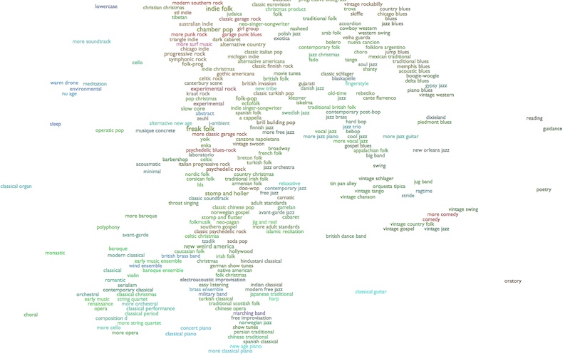
The idea is to semi-subliminally surface some of the other analytical dimensions from the underlying music space, beyond the two that drive the XY axes, so that there's a little less visual flattening.
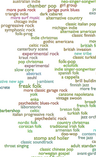
For example, in the section on the right, above, you can see the reddish color running from "garage punk blues" to "experimental rock" to "more classic garage rock" and "psychedelic blues-rock", and the light blue linking "alternative new age" to "abstract" to "new tribe". These are good associative threads.
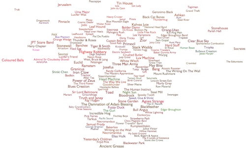
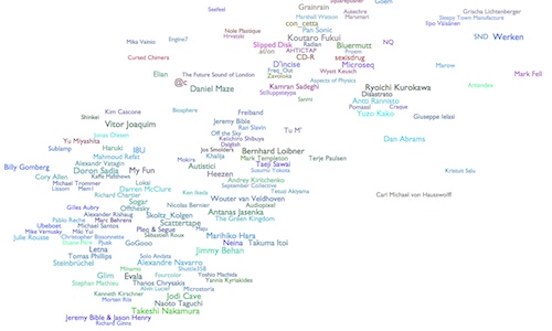
And the maps within each genre (psychedelic blues-rock on the left, below, and abstract on the right) show both overall corresponding tints, and variable degrees of internal uniformity:
Logistically, this works by mapping three additional acoustic metrics into the red, green and blue color-channels. I arrived at this particular combination through not-at-all-exhaustive experimentation, so maybe I'll come up with a better one, but for the moment red is energy, green is dynamic variation, and blue is instrumentalness. I don't recommend trying to think too hard about this, as the combinatory effects are kind of hard to parse, but it gives your eye things to follow. As data-presentation this is rather undisciplined, but as computational evocation it seems potentially interesting nonetheless.
Which you could say of music, too.
¶ Post-Neo-Traditional Pop Post-Thing · 29 September 2014 essay/listen/tech
As part of a conference on Music and Genre at McGill University in Montreal, over this past weekend, I served as the non-academic curiosity at the center of a round-table discussion about the nature of musical genres, and of the natures of efforts to understand genres, and of the natures of efforts to understand the efforts to understand genres. Plus or minus one or two levels of abstraction, I forget exactly.
My "talk" to open this conversation was not strictly scripted to begin with, and I ended up rewriting my oblique speaking notes more or less over from scratch as the day was going on, anyway. One section, which I added as I listened to other people talk about the kinds of distinctions that "genres" represent, attempted to list some of the kinds of genres I have in my deliberately multi-definitional genre map. There ended up being so many of these that I mentioned only a selection of them during the talk. So here, for extended (potential) amusement, is the whole list I had on my screen:
Kinds of Genres
(And note that this isn't even one kind of kind of genre...)
- conventional genre (jazz, reggae)
- subgenre (calypso, sega, samba, barbershop)
- region (malaysian pop, lithumania)
- language (rock en espanol, hip hop tuga, telugu, malayalam)
- historical distance (vintage swing, traditional country)
- scene (slc indie, canterbury scene, juggalo, usbm)
- faction (east coast hip hop, west coast rap)
- aesthetic (ninja, complextro, funeral doom)
- politics (riot grrrl, vegan straight edge, unblack metal)
- aspirational identity (viking metal, gangster rap, skinhead oi, twee pop)
- retrospective clarity (protopunk, classic peruvian pop, emo punk)
- jokes that stuck (crack rock steady, chamber pop, fourth world)
- influence (britpop, italo disco, japanoise)
- micro-feud (dubstep, brostep, filthstep, trapstep)
- technology (c64, harp)
- totem (digeridu, new tribe, throat singing, metal guitar)
- isolationism (faeroese pop, lds, wrock)
- editorial precedent (c86, zolo, illbient)
- utility (meditation, chill-out, workout, belly dance)
- cultural (christmas, children's music, judaica)
- occasional (discofox, qawaali, disco polo)
- implicit politics (chalga, nsbm, dangdut)
- commerce (coverchill, guidance)
- assumed listening perspective (beatdown, worship, comic)
- private community (orgcore, ectofolk)
- dominant features (hip hop, metal, reggaeton)
- period (early music, ska revival)
- perspective of provenance (classical (composers), orchestral (performers))
- emergent self-identity (skweee, progressive rock)
- external label (moombahton, laboratorio, fallen angel)
- gender (boy band, girl group)
- distribution (viral pop, idol, commons, anime score, show tunes)
- cultural institution (tin pan alley, brill building pop, nashville sound)
- mechanism (mashup, hauntology, vaporwave)
- radio format (album rock, quiet storm, hurban)
- multiple dimensions (german ccm, hindustani classical)
- marketing (world music, lounge, modern classical, new age)
- performer demographics (military band, british brass band)
- arrangement (jazz trio, jug band, wind ensemble)
- competing terminology (hip hop, rap; mpb, brazilian pop music)
- intentions (tribute, fake)
- introspective fractality (riddim, deep house, chaotic black metal)
- opposition (alternative rock, r-neg-b, progressive bluegrass)
- otherness (noise, oratory, lowercase, abstract, outsider)
- parallel terminology (gothic symphonic metal, gothic americana, gothic post-punk; garage rock, uk garage)
- non-self-explanatory (fingerstyle, footwork, futurepop, jungle)
- invented distinctions (shimmer pop, shiver pop; soul flow, flick hop)
- nostalgia (new wave, no wave, new jack swing, avant-garde, adult standards)
- defense (relaxative, neo mellow)
That was at the beginning of the talk. At the end I had a different attempt at an amusement prepared, which was a short outline of my mental draft of the paper I would write about genre evolution, if I wrote papers. In a way this is also a way of listing kinds of kinds of things:
The Every-Noise-at-Once Unified Theory of Musical Genre Evolution
And it would be awesome.
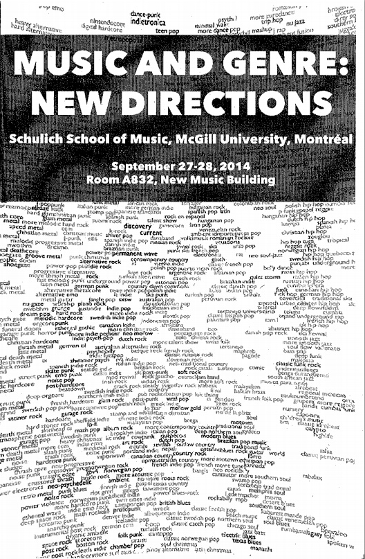
[Also, although I was the one glaringly anomalous non-academic at this academic conference, let posterity record the cover of the conference program.]
My "talk" to open this conversation was not strictly scripted to begin with, and I ended up rewriting my oblique speaking notes more or less over from scratch as the day was going on, anyway. One section, which I added as I listened to other people talk about the kinds of distinctions that "genres" represent, attempted to list some of the kinds of genres I have in my deliberately multi-definitional genre map. There ended up being so many of these that I mentioned only a selection of them during the talk. So here, for extended (potential) amusement, is the whole list I had on my screen:
Kinds of Genres
(And note that this isn't even one kind of kind of genre...)
- conventional genre (jazz, reggae)
- subgenre (calypso, sega, samba, barbershop)
- region (malaysian pop, lithumania)
- language (rock en espanol, hip hop tuga, telugu, malayalam)
- historical distance (vintage swing, traditional country)
- scene (slc indie, canterbury scene, juggalo, usbm)
- faction (east coast hip hop, west coast rap)
- aesthetic (ninja, complextro, funeral doom)
- politics (riot grrrl, vegan straight edge, unblack metal)
- aspirational identity (viking metal, gangster rap, skinhead oi, twee pop)
- retrospective clarity (protopunk, classic peruvian pop, emo punk)
- jokes that stuck (crack rock steady, chamber pop, fourth world)
- influence (britpop, italo disco, japanoise)
- micro-feud (dubstep, brostep, filthstep, trapstep)
- technology (c64, harp)
- totem (digeridu, new tribe, throat singing, metal guitar)
- isolationism (faeroese pop, lds, wrock)
- editorial precedent (c86, zolo, illbient)
- utility (meditation, chill-out, workout, belly dance)
- cultural (christmas, children's music, judaica)
- occasional (discofox, qawaali, disco polo)
- implicit politics (chalga, nsbm, dangdut)
- commerce (coverchill, guidance)
- assumed listening perspective (beatdown, worship, comic)
- private community (orgcore, ectofolk)
- dominant features (hip hop, metal, reggaeton)
- period (early music, ska revival)
- perspective of provenance (classical (composers), orchestral (performers))
- emergent self-identity (skweee, progressive rock)
- external label (moombahton, laboratorio, fallen angel)
- gender (boy band, girl group)
- distribution (viral pop, idol, commons, anime score, show tunes)
- cultural institution (tin pan alley, brill building pop, nashville sound)
- mechanism (mashup, hauntology, vaporwave)
- radio format (album rock, quiet storm, hurban)
- multiple dimensions (german ccm, hindustani classical)
- marketing (world music, lounge, modern classical, new age)
- performer demographics (military band, british brass band)
- arrangement (jazz trio, jug band, wind ensemble)
- competing terminology (hip hop, rap; mpb, brazilian pop music)
- intentions (tribute, fake)
- introspective fractality (riddim, deep house, chaotic black metal)
- opposition (alternative rock, r-neg-b, progressive bluegrass)
- otherness (noise, oratory, lowercase, abstract, outsider)
- parallel terminology (gothic symphonic metal, gothic americana, gothic post-punk; garage rock, uk garage)
- non-self-explanatory (fingerstyle, footwork, futurepop, jungle)
- invented distinctions (shimmer pop, shiver pop; soul flow, flick hop)
- nostalgia (new wave, no wave, new jack swing, avant-garde, adult standards)
- defense (relaxative, neo mellow)
That was at the beginning of the talk. At the end I had a different attempt at an amusement prepared, which was a short outline of my mental draft of the paper I would write about genre evolution, if I wrote papers. In a way this is also a way of listing kinds of kinds of things:
The Every-Noise-at-Once Unified Theory of Musical Genre Evolution
- There is a status quo;
- Somebody becomes dissatisfied with it;
- Several somebodies find common ground in their various dissatisfactions;
- Somebody gives this common ground a name, and now we have Thing;
- The people who made thing before it was called Thing are now joined by people who know Thing as it is named, and have thus set out to make Thing deliberately, and now we have Thing and Modern Thing, or else Classic Thing and Thing, depending on whether it happened before or after we graduated from college;
- Eventually there's enough gravity around Thing for people to start trying to make Thing that doesn't get sucked into the rest of Thing, and thus we get Alternative Thing, which is the non-Thing thing that some people know about, and Deep Thing, which is the non-Thing thing that only the people who make Deep Thing know;
- By now we can retroactively identify Proto-Thing, which is the stuff before Thing that sounds kind of thingy to us now that we know Thing;
- Thing eventually gets reintegrated into the mainstream, and we get Pop Thing;
- Pop Thing tarnishes the whole affair for some people, who head off grumpily into Post Thing;
- But Post Thing is kind of dreary, and some people set out to restore the original sense of whatever it was, and we get Neo-Thing;
- Except Neo-Thing isn't quite the same as the original Thing, so we get Neo-Traditional Thing, for people who wish none of this ever happened except the original Thing;
- But Neo-Thing and Neo-Traditional Thing are both kind of precious, and some people who like Thing still also want to be rock stars, and so we get Nu Thing;
- And this is all kind of fractal, so you could search-and-replace Thing with Post Thing or Pop Thing or whatever, and after a couple iterations you can quickly end up with Post-Neo-Traditional Pop Post-Thing.
And it would be awesome.
[Also, although I was the one glaringly anomalous non-academic at this academic conference, let posterity record the cover of the conference program.]

¶ The Sounds of Places · 17 September 2014 listen/tech
At Spotify, where I work, we have listeners in a large and growing numbers of countries around the world. You might theorize that people in different countries listen to different music. You might be curious to hear this music. If you are me, you might be really curious, to the point of a kind of obsessive, consuming fear that there is awesome and bizarre and wonderful music in, say, Estonia, that you're not hearing.
We do, in fact, have per-country top-track charts in Spotify itself. These measure the absolute popularity of tracks among the sub-population listening in a given country. Statistically, though, these charts tend to be fairly well dominated by global hits. This isn't a technical flaw, but it does mean that those charts are not especially useful for the purpose of musical tourism. When I say I want to hear what they're listening to in Estonia, I mean that I want to hear what they're listening to Estonia that, proportionally speaking, nobody is listening to anywhere else. I want to hear the music that is most uniquely Estonian, or more precisely the music that is most uniquely loved by Estonians.
So I've been experimenting with code to generate the kind of additional alternate chart that I mean, measuring the most distinctive listening of a country. It's not perfect, and the occasional global hit wanders in due to emotionally irrelevant factors like regional licensing contingencies. But for the most part these charts do appear to be rather effectively getting past the global to the local.
I was going to share an alphabetized list of these, for anybody who shares my curiosity. But I have this code to produce visual maps of music groupings, and it's just as easy to feed it countries as it is to feed it genres. And thus I've done the somewhat bizarre exercise of producing a visual remapping of inherently geographic data using non-geographic coordinates.
This sounds silly, I think. But it turns out to be surprisingly interesting. Here's the map:
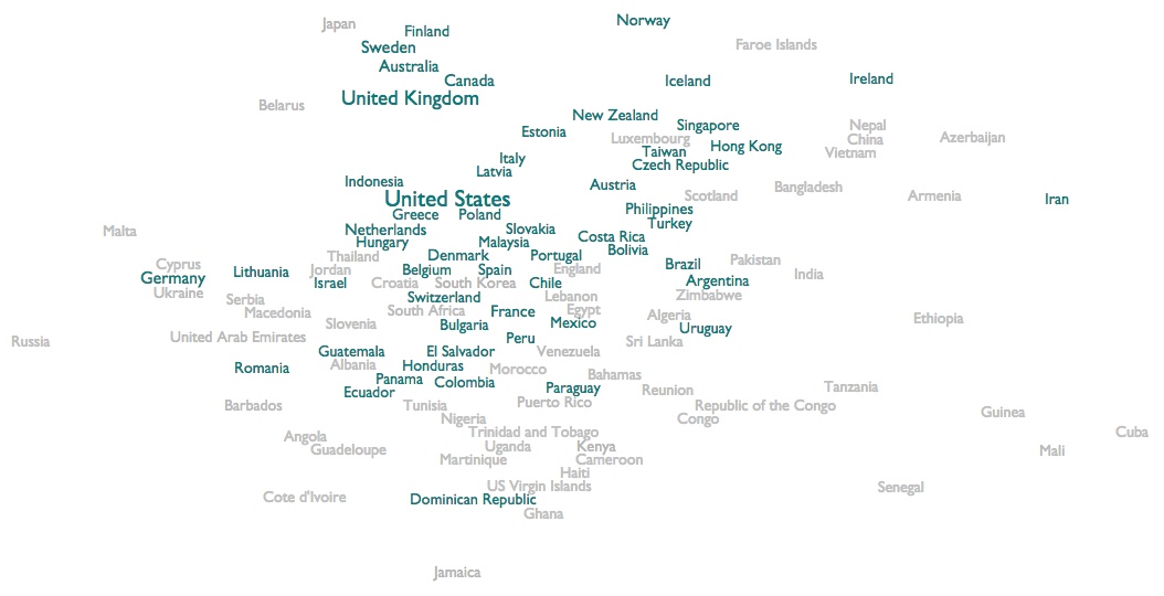
This is a readability-adjusted scatter-plot of two acoustic variables averaged across a few thousand of the most popular and representative songs from each country.
The vertical axis is a metric quality we call "bounciness", so the countries at the top are characterized by denser and more atmospheric music, and the countries at the bottom are characterized by sparer music with spikier beats and more space between them. E.g., the constant roar of atmospheric black metal or the slow humming whir of classical organ music would be at the top, and the jumpy beats of hip hop or the pulse of reggae would be at the bottom.
The horizontal axis is another score we call "organism". The countries towards the left are characterized by music with more electric arrangements and/or more mechanical rhythms. The extreme of this quality gets you relentless techno. The countries towards the right are characterized by music with more acoustic arrangements and/or more human and variable rhythms. The extremes of this get you jigs and reels, or sitars.
[The main genre map is the other way around, with bounciness from left to right, and organism up and down, but this way we get Scandinavia at the non-geographic north, and China and India towards the non-geographic east!]
But what's intriguing here, obviously, is not where individual countries appear, but which countries cluster together. Japan, Australia and Canada all basically fall into acoustic Scandinavia. Africa and the Caribbean form a unified acoustic southern hemisphere. Malaysia is acoustically closer to Slovakia than to China, and Lebanon is acoustically closer to South Korea and Mexico than to Iran. I feel like we are detecting at least the faint echoes of a kind of cultural truth.
Click any country to see the calculated playlist of the 100 most distinctively popular songs in that country. You need Spotify for this to work, and as you'll discover, in some cases international publishing rights work counter to personal curiosity, and less than 100 will actually be available for you to stream. If you're extra-curious, in Spotify Preferences you can uncheck "Hide unplayable tracks", and then you'll at least get to see all 100.
Estonia turns out to be pretty much exactly as awesome as I imagined it had to be if I could only hear it.
We do, in fact, have per-country top-track charts in Spotify itself. These measure the absolute popularity of tracks among the sub-population listening in a given country. Statistically, though, these charts tend to be fairly well dominated by global hits. This isn't a technical flaw, but it does mean that those charts are not especially useful for the purpose of musical tourism. When I say I want to hear what they're listening to in Estonia, I mean that I want to hear what they're listening to Estonia that, proportionally speaking, nobody is listening to anywhere else. I want to hear the music that is most uniquely Estonian, or more precisely the music that is most uniquely loved by Estonians.
So I've been experimenting with code to generate the kind of additional alternate chart that I mean, measuring the most distinctive listening of a country. It's not perfect, and the occasional global hit wanders in due to emotionally irrelevant factors like regional licensing contingencies. But for the most part these charts do appear to be rather effectively getting past the global to the local.
I was going to share an alphabetized list of these, for anybody who shares my curiosity. But I have this code to produce visual maps of music groupings, and it's just as easy to feed it countries as it is to feed it genres. And thus I've done the somewhat bizarre exercise of producing a visual remapping of inherently geographic data using non-geographic coordinates.
This sounds silly, I think. But it turns out to be surprisingly interesting. Here's the map:

This is a readability-adjusted scatter-plot of two acoustic variables averaged across a few thousand of the most popular and representative songs from each country.
The vertical axis is a metric quality we call "bounciness", so the countries at the top are characterized by denser and more atmospheric music, and the countries at the bottom are characterized by sparer music with spikier beats and more space between them. E.g., the constant roar of atmospheric black metal or the slow humming whir of classical organ music would be at the top, and the jumpy beats of hip hop or the pulse of reggae would be at the bottom.
The horizontal axis is another score we call "organism". The countries towards the left are characterized by music with more electric arrangements and/or more mechanical rhythms. The extreme of this quality gets you relentless techno. The countries towards the right are characterized by music with more acoustic arrangements and/or more human and variable rhythms. The extremes of this get you jigs and reels, or sitars.
[The main genre map is the other way around, with bounciness from left to right, and organism up and down, but this way we get Scandinavia at the non-geographic north, and China and India towards the non-geographic east!]
But what's intriguing here, obviously, is not where individual countries appear, but which countries cluster together. Japan, Australia and Canada all basically fall into acoustic Scandinavia. Africa and the Caribbean form a unified acoustic southern hemisphere. Malaysia is acoustically closer to Slovakia than to China, and Lebanon is acoustically closer to South Korea and Mexico than to Iran. I feel like we are detecting at least the faint echoes of a kind of cultural truth.
Click any country to see the calculated playlist of the 100 most distinctively popular songs in that country. You need Spotify for this to work, and as you'll discover, in some cases international publishing rights work counter to personal curiosity, and less than 100 will actually be available for you to stream. If you're extra-curious, in Spotify Preferences you can uncheck "Hide unplayable tracks", and then you'll at least get to see all 100.
Estonia turns out to be pretty much exactly as awesome as I imagined it had to be if I could only hear it.
We used to call playlists "compilations", and they used to be published on big flat pieces of plastic. Weird.
The one that formed the core of my personal education in "punk" music was a 1984 double-LP from Cherry Red records called Burning Ambitions: A History of Punk.
This comp itself is not available on Spotify. All but one of the songs are, though, in one form or another, so I have reconstructed it for posterity:
¶ The Point of a Map Is to Travel · 4 September 2014 listen/tech
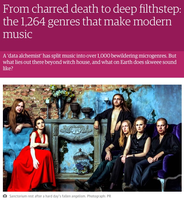
The Guardian today published a piece by Rob Fitzpatrick that I think is now my favorite thing written about my genre map, because instead of being about the map, it's about the music he found using the map.

¶ Time-Lapse: 24 Songs for 24 Hours · 21 August 2014 listen/tech
One of the things I've been experimenting with at work is finding music by how distinctively it appeals to particular audiences. Mostly we're interested in regional and demographic slices, but out of idle curiosity I tried running the same code against hours of the day.
That is, for each hour in the day I calculated which songs were most disproportionately played during that particular hour as opposed to in general (by US listeners). From this I was able to assemble a compressed 24-song time-lapse exaggeration of the sounds and biases of the American day.
Our caricatured day starts at dawn with a gentle, soothing Jonsí wake-up. It gets a little preachy (literally) over breakfast, but then Seinabo Sey and Shawn Mendes slowly add some restrained alertness as the coffee takes effect. Spoon and Jason Aldean and Sam Smith carry us unhurriedly through late morning and lunch.
Early afternoon is, apparently, the official time-slot for imported Australian boy-pop, as 5 Seconds of Summer and Troye Sivan sigh and swoon for a couple songs. I can't really explain what O.A.R. is doing after that, but then it's a solid block of modern (and largely not child-suitable) pop/hip-hop straight through dinner (including, amusingly, a song called "2AM" that is very definitely more popular at 2PM than 2AM).
Eventually I guess the hip-hop kids go to bed, and the indie/pop-punk kids stay up a little later to briefly rock.
Then it's nighttime, and we get increasingly meditative with Jon Hopkins, Hans Zimmer and Ludovico Einaudi for a while before resorting (and the data really do indicate this) to actual background noise for a couple solid restorative hours of REM sleep.
[My own daily listening bears no resemblance to this, at all. Nor, I suspect, does any individual's. But the thing has more internal logic than I expected it to have, actually, so there it is.]
[Or, if you'd rather, this:]
¶ Live in Montreal · 20 August 2014 listen/tech
On Friday, September 26, I'll be giving a "seminar" on music exploration and data alchemy at the Centre for Interdisciplinary Research in Music Media and Technology, at the Schulich School of Music at McGill University.
On the 27th and 28th I'll also be participating in a McGill-hosted conference called Music and Genre: New Directions.
[If those are too soon and too far north for you, I'm also in the lineup for a proposed SXSW 2015 panel called "Beyond Genre: How To Better Connect Fans w/ Music", which you are welcome to vote for if you like voting for things. That would be next March in Austin.]
¶ Play What You Say · 20 July 2014 listen/tech
Sometimes in blog posts I mention songs. Like Clockwise's "War Story Part One", which is really good. You should listen to it, seriously.
In fact, I would like to help you listen to it, not least because there's really no reason you should listen to it just because I say so, so listening to it better be really easy.
The fancy way would be to go find the track on Spotify, right-click it and pick "Copy Embed Code", and then paste that code into my HTML to get this embedded Play button.
That's pretty nice.
But sometimes I'm just mentioning a song in passing, or in some particular formatting like a table with other stuff, and the fancy embedded thing isn't what I want. It would be nice to also have a lower-overhead way to just mark a song-reference in text as a song-reference, and let some music-intelligence thing somewhere figure out how to actually find and play it.
So I made a first version of such a thing. It's pretty crude, in that you have to know about editing HTML, and be in an environment where you're allowed to. And it just plays a :30 sample, it doesn't log you in and play the whole song. But the HTML itself, at least, is very simple. So if you have a need for which those are acceptable conditions, and you want to try it, here's how it works.
First, add these two lines to the HEAD of your page:
<link rel="stylesheet" href="https://everynoise.com/spotplay.css" type="text/css">
<script type="text/javascript" src="https://everynoise.com/spotplay.js"></script>
And then just write your song-reference inside a span with the class "play", like this:
<span class=play>Andy Clockwise "War Story Part One"</span>
which produces this (click it once to play the excerpt, click again to stop it):
Andy Clockwise "War Story Part One"
When you play an excerpt, a little musical-note link also gets magically inserted, which you can use to go hear the whole song on Spotify if you want.
You can also refer to things in the possessive form Artist's "Song", like <span class=play>Big Deal's "Always Boys"</span> to produce Big Deal's "Always Boys", or the reverse-credit form "Song" by Artist, like <span class=play>"Dangerous Days" by Zola Jesus</span> to produce "Dangerous Days" by Zola Jesus, and it should be able to figure out what you mean. If you want to attach the reference to some visible text other than the artist and song-name, you can put the actual reference info in the tag, like this, where the code for that linked "this" is:
<span class=play artist="Broods" track="L.A.F">this</span>
and if for some reason you happen to have the Spotify URI for a particular track and would rather be precise about it, you can do this, where the code for that linked "this" is:
<span class=play trackid="spotify:track:6Qb82IcaWAB9ABeTyuzsV0">this</span>
Also, if for some reason you really don't want the Spotify link to be inserted, you can add "nolink=true" to your span to disable that feature, like this:
<span class=play nolink=true>Whitebear "Transmute / Release"</span>
which produces this (click to see the begrudging absence of magic):
Whitebear "Transmute / Release"
That's all I've got so far. If you try it, please let me know if it works for you, in either the functional or appealing senses. I'll be here thrashing around to "Snake Jaw" by White Lung.
(This all works by using the extremely excellent new Spotify Web API to look up songs and play excerpts.)
1 December 2015, three updates:
1: If you have a large page and want things to be playable before the whole page finishes loading, you can attach the onclick handlers yourself instead of waiting for them to be attached automatically. Just add onclick="playmeta(this)" to the same elements you marked with class=play.
2: If a track doesn't have a preview, for some reason, the code will set the attribute "unplayable" on your target element to be true. You can style this with CSS if you wish. For example, this makes linked images invert if their attached tracks are unplayable:
.play[unplayable] img {-webkit-filter: invert(1); filter: invert(1)}
3: If you want to refer to an album, instead of an individual track, you can add "albumid=spotify:album:wHaTeVeR" to your element. Like this:
<span class=play albumid=spotify:album:3yIcTZZOUsgq1xlkmtxnp6>Aedliga: The Format of the Air</span>
A representative track from the album will be chosen automatically by extremely sophisticated and complex logic, by which I mean that it will pick the first track unless the first track is very short and the second track isn't, or the first track has "Intro" in the title, in either of which cases it will pick the second track. Fancy.
¶ We Are Electric, Energized and New · 19 July 2014 listen/tech
This morning I was listening to the Madden Brothers' "We Are Done", which came up on The Echo Nest Discovery list this week. I have the sinking/tingling feeling, and we'll see if I'm right because this isn't necessarily one of my actual talents, that this song is going to become ubiquitous enough in my environment that I'll look back wistfully on listening to it entirely voluntarily.
But listening to it also made me think about Fun's "We Are Young" and Pitbull and JLo's World Cup song "We Are One" and Taylor Swift's "We Are Never Ever Getting Back Together". We are, we are, we are, we are. This kind of pointless internal word-association used to dissipate harmlessly inside my head. But now I have the resources to indulge it at scale.
So I made a Spotify playlist of 100 songs that follow the title-pattern "We Are [something]". And then I realized there were more of them, so I made a playlist of 1000 of them. And having done that, it was trivial to make similar playlists for "I Am [something]", You Are [something]", "He Is [something]", "She Is [something]" and "They Are [something]", so I did that, too. And then I have a thing that will summarize the contents of a playlist in various ways, so I ran it on these because why not?
The first thing one finds is that I, You and We songs are way more prevalent than She and They songs. And although there are plenty of He songs, they are disconcertingly overwhelmingly religious, which is kind of different. So I kept the He/She/They playlists for your amusement, but I only analyzed I, You and We.
Here's what The Echo Nest's listening machines report:
The I/You/We scores here are average values across the 1000 songs for each title pattern. Most Echo Nest metrics are normalized to be a unit-less decimal value between 0 and 1. Loudness is customarily measured on a weird negative scale, Tempo is in beats-per-minute, and Year is obviously in years.
The Power column measures the discriminatory power of each metric. So the two metrics that discriminate best between these three sets of songs are Acousticness and Energy. The metrics with the least power to discriminate between these sets are Valence (emotional mood), Bounciness (atmospheric density vs spiky jumpiness) and Danceability, all of which vary much more widely within each category than between them. Comparing the whole set to my earlier measurements of genre, year, popularity and country shows that the pronoun sets are about as distinct as sets based on country of origin, and more distinct than sets based on popularity, but less distinct on the whole than sets based on year or genre.
Which is a lot more difference than I expected, actually, particularly between You and We. Individual songs can have any individual character, but taken as an aggregate, "You Are" songs are significantly calmer, more acoustic and more organic in their rhythm. "We Are" songs are more energetic, more electric, notably more mechanically driven, and louder. That is, we sing more tender songs to each other, and more anthems about ourselves together.
We also seem to be singing more We Are songs lately. Or, to be more precise, because these 1000-song subsets are selected by popularity, more-recent We Are songs are a little more popular now in the aggregate. Attentive observers may recall that my earlier study showed correlations between time and both Acousticness and Energy over the years from 1950 to 2013. But both song-sets here are largely more-recent songs from well after the period of greatest historical change for either metric, and the magnitude of difference is significantly larger than the degree of variation predicted by year alone.
The I Am songs fall into an interestingly conflicted middle ground. They are more acoustic and less energetic than the rousing We Are anthems, but not as tender and sensitive as the wistful You Are odes. But while the I Am songs are closer to the You Are songs in rhythmic regularity, they're closer to the We Are songs in tempo.
So while you might reasonably expect We to be a compromise between I and You, this brief study clearly and crushingly demonstrates that the pre-computational centuries of the study of the psychology of self have been a sad speculative waste of time. Music and math prove that our individual selves float suspended between what we project onto others and what we dream that we could achieve together.
But listening to it also made me think about Fun's "We Are Young" and Pitbull and JLo's World Cup song "We Are One" and Taylor Swift's "We Are Never Ever Getting Back Together". We are, we are, we are, we are. This kind of pointless internal word-association used to dissipate harmlessly inside my head. But now I have the resources to indulge it at scale.
So I made a Spotify playlist of 100 songs that follow the title-pattern "We Are [something]". And then I realized there were more of them, so I made a playlist of 1000 of them. And having done that, it was trivial to make similar playlists for "I Am [something]", You Are [something]", "He Is [something]", "She Is [something]" and "They Are [something]", so I did that, too. And then I have a thing that will summarize the contents of a playlist in various ways, so I ran it on these because why not?
The first thing one finds is that I, You and We songs are way more prevalent than She and They songs. And although there are plenty of He songs, they are disconcertingly overwhelmingly religious, which is kind of different. So I kept the He/She/They playlists for your amusement, but I only analyzed I, You and We.
Here's what The Echo Nest's listening machines report:
| Metric | I Am... | You Are... | We Are... | Power |
| Acousticness | 0.260 | 0.383 | 0.182 | 0.318 |
| Bounciness | 0.398 | 0.412 | 0.411 | 0.041 |
| Danceability | 0.498 | 0.508 | 0.524 | 0.077 |
| Energy | 0.649 | 0.541 | 0.705 | 0.333 |
| Instrumentalness | 0.196 | 0.171 | 0.235 | 0.099 |
| Loudness | -8.47 | -9.58 | -7.91 | 0.198 |
| Mechanism | 0.494 | 0.481 | 0.592 | 0.238 |
| Organism | 0.436 | 0.486 | 0.346 | 0.294 |
| Tempo | 124.0 | 118.1 | 125.6 | 0.137 |
| Valence | 0.424 | 0.421 | 0.421 | 0.007 |
| Year | 2004.4 | 2003.2 | 2007.1 | 0.201 |
The I/You/We scores here are average values across the 1000 songs for each title pattern. Most Echo Nest metrics are normalized to be a unit-less decimal value between 0 and 1. Loudness is customarily measured on a weird negative scale, Tempo is in beats-per-minute, and Year is obviously in years.
The Power column measures the discriminatory power of each metric. So the two metrics that discriminate best between these three sets of songs are Acousticness and Energy. The metrics with the least power to discriminate between these sets are Valence (emotional mood), Bounciness (atmospheric density vs spiky jumpiness) and Danceability, all of which vary much more widely within each category than between them. Comparing the whole set to my earlier measurements of genre, year, popularity and country shows that the pronoun sets are about as distinct as sets based on country of origin, and more distinct than sets based on popularity, but less distinct on the whole than sets based on year or genre.
Which is a lot more difference than I expected, actually, particularly between You and We. Individual songs can have any individual character, but taken as an aggregate, "You Are" songs are significantly calmer, more acoustic and more organic in their rhythm. "We Are" songs are more energetic, more electric, notably more mechanically driven, and louder. That is, we sing more tender songs to each other, and more anthems about ourselves together.
We also seem to be singing more We Are songs lately. Or, to be more precise, because these 1000-song subsets are selected by popularity, more-recent We Are songs are a little more popular now in the aggregate. Attentive observers may recall that my earlier study showed correlations between time and both Acousticness and Energy over the years from 1950 to 2013. But both song-sets here are largely more-recent songs from well after the period of greatest historical change for either metric, and the magnitude of difference is significantly larger than the degree of variation predicted by year alone.
The I Am songs fall into an interestingly conflicted middle ground. They are more acoustic and less energetic than the rousing We Are anthems, but not as tender and sensitive as the wistful You Are odes. But while the I Am songs are closer to the You Are songs in rhythmic regularity, they're closer to the We Are songs in tempo.
So while you might reasonably expect We to be a compromise between I and You, this brief study clearly and crushingly demonstrates that the pre-computational centuries of the study of the psychology of self have been a sad speculative waste of time. Music and math prove that our individual selves float suspended between what we project onto others and what we dream that we could achieve together.

