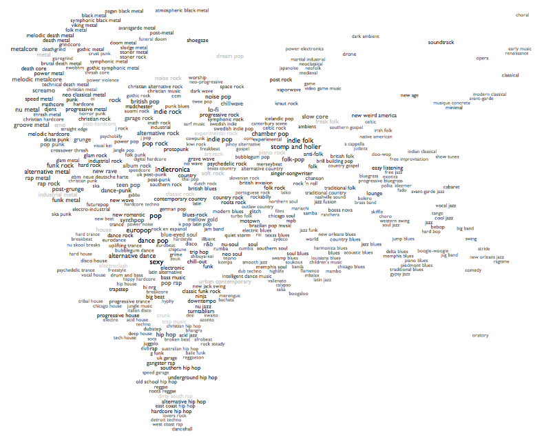
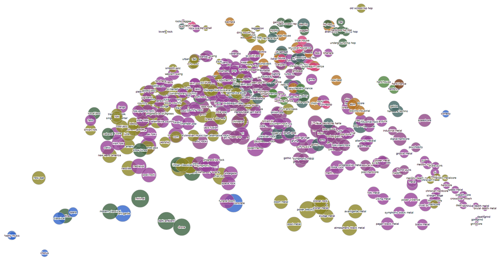
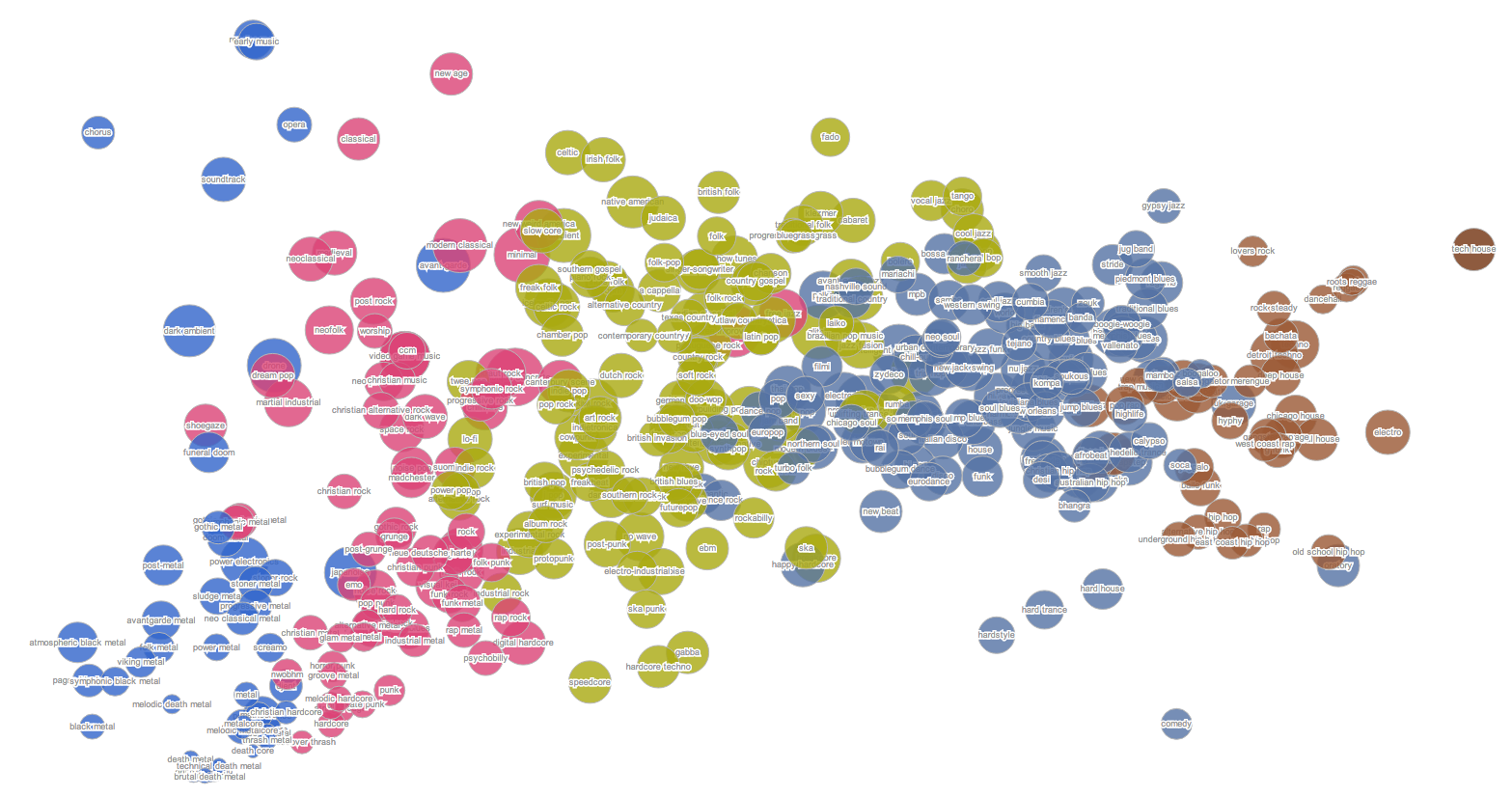
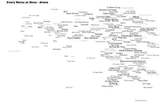
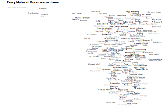
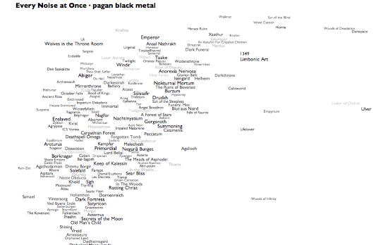
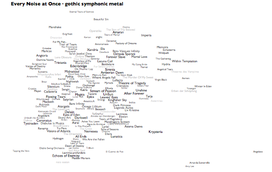
19 January 2012 to 18 November 2010
· My version (the long form)
· Other people's version
Metal (ZIP download, 207MB)
1. Blood Stain Child: "Stargazer" (4:21)
2. Elizium: "Nemesis" (5:29)
3. Unleash the Archers: "Realm of Tomorrow" (5:15)
4. Pantheist: "Be Here" (10:47)
5. Subway to Sally: "Nichts ist fur immer" (3:37)
6. Dornenreich: "Fahrte Der Nacht" (4:49)
7. Jesu: "Sedatives" (5:10)
8. Terra Tenebrosa: "Probing The Abyss" (6:03)
9. Thy Catafalque: "Fekete mezõk" (9:20)
10. Lifelover: "Expandera" (3:49)
11. Wolfchant: "Black Fire" (4:20)
12. Avven: "Ros" (3:13)
13. Heretoir: "Fatigue" (7:17)
14. Alcest: "Elévation (Rerecorded)" (13:26)
15. Agrypnie: "Augenblick" (7:28)
16. Frijgard: "Frijgard" (5:39)
17. Dalriada: "Mennyei Harang" (6:16)
18. Arven: "Dark Red Desire" (4:12)
19. Oak Pantheon: "Architect of the Void Pt II" (6:45)
20. Kampfar: "Bergtatt (In D Major - Bonus Track)" (5:28)
21. In Flames: "Sounds Of A Playground Fading" (4:43)
22. Andraste: "Black Birds Of Carrion" (5:16)
23. Nemesea: "Afterlife" (3:12)
24. Leviathan: "Blood Red And True" (6:57)
Non-Metal (ZIP download, 187MB)
1. Airborne Toxic Event: "All At Once" (5:16)
2. Gazelle Twin: "Changelings" (3:23)
3. Joy Formidable: "The Greatest Light Is The Greatest Shade" (5:19)
4. Harris, Emmylou: "Hard Bargain" (3:22)
5. Hatfield, Juliana: "Failure" (3:35)
6. Keene, Tommy: "Already Made Up Your Mind" (3:29)
7. M83: "OK Pal" (3:58)
8. Low: "Nothing But Heart" (8:10)
9. Sounds: "Won't Let Them Tear Us Apart" (4:07)
10. Blondie: "Mother" (3:09)
11. Sloan: "Green Gardens, Cold Montreal" (2:01)
12. The Decemberists: "Calamity Song" (3:50)
13. Mountain Goats: "Damn These Vampires" (3:24)
14. Buckner, Richard: "Escape" (3:32)
15. Roxette: "She's Got Nothing On (But the Radio)" (3:33)
16. Roxette: "Speak to Me" (3:41)
17. Hatfield, Juliana: "Don't Wanna Dance (Brad Walsh Remix)" (3:09)
18. Clarkson, Kelly: "I Forgive You" (3:04)
19. Reik: "No Te Quiero Olvidar" (3:38)
20. Magnum: "Wild Angels" (5:41)
21. Mogwai: "George Square Thatcher Death Party" (3:59)
22. Kerretta: "A Ways to Uprise" (5:29)
23. Emily Bezar: "May In Mesolimbia" (18:21)
24. Ulver: "Stone Angels" (14:53)
25. M83: "Raconte-moi une histoire" (4:07)
¶ Quantifying School · 9 September 2011 essay/tech
[May 2012 note: Needle, the database system I used to collect, analyze and show this information, was acquired and shut down by Google. Thus many of the links below go to non-functional snapshots of Needle pages I took before the shutdown. The points should survive.]
Boston Magazine recently published their annual Best Schools ranking. They've been doing this for years, and are known for various other Boston rankings as well (places to live, places to eat...), so by now you'd expect them to be pretty good at it.
Here's what "pretty good at it" amounts to, in 2011: two lists of 135 school districts, one with some configuration information (enrollment, student/teacher ratio, per-pupil spending, graduation rate, number of sports teams, what kind of pre-k they offer, how many AP classes), the second with test scores, and exactly this much methodological transparency: "we crunched the data and came up with this".
Some obvious things that you can't do with this information:
- sort it by any criteria other than the magazine's rank
- see the stuff in the first table alongside the stuff in the second
- understand which figures are actually part of the ranking, in what weights
- fact-check it
- compare it in bulk to any other information about these schools
- compare it to any other information about the towns served by these districts
- figure out why certain towns were included or excluded
- find out what towns are even meant by non-town district names if you don't already happen to know
- evaluate the significance of any individual factor, or the correlations of any set of them
This is not a proud state of the art. And the quality of secondary journalism around it emphasizes the point further: this article about Salem's low ranking basically just turns a table-row into prose sentences, with no context or analysis, and fails to even realize that the 135 districts in the ranking represent just the immediate vicinity of Boston, not the whole state. This Melrose article claims Melrose "climbed" from 97th last year to 94th, but then has to add a note that last year's ranking was of high schools, not whole districts, and thus not even the same thing. Swampscott exults in making the top 50. Malden fights back at being ranked 119th. But nobody actually knows what the rankings mean or signify, because Boston Magazine doesn't say.
In an attempt to improve this situation a little, I imported these two tables of information into Needle:
This in itself was sufficient to unify the two tables and render them malleable, which seems to me like the most basic start. Now at least you can re-sort them yourself, and choose what to look at next to what.
And a little sorting, in fact, quickly reveals some statistical oddities. North Attleborough was listed with an SAT Reading score of 823, which since SAT scores only go up to 800, is very obviously wrong. Some trivial research verifies that this was a typo for 523, and while typos happen in journalism all the time, a typo in data journalism is a dangerous indication that some human has been retyping things by hand, which is never good. (This datum has now been fixed in the magazine's table.)
More interestingly, when you start scrutinizing each district's 5th/8th/10th-grade MCAS scores, you find some surprising skews. Here are the MCAS and SAT scores for Georgetown:
MCAS 5 English: 74
MCAS 5 Science: 54
MCAS 5 Math: 42
MCAS 8 English: 81
MCAS 8 Science: 36
MCAS 8 Math: 51
MCAS 10 English: 92
MCAS 10 Science: 90
MCAS 10 Math: 88
SAT Reading: 570
SAT Writing: 566
SAT Math: 584
Boston Magazine says they "looked within those districts to determine how schools were improving (or not) over time". But that's not what these scores are measuring. These aren't time-slices for a single cohort, these are different tests being given to different kids. If you're interested in history, the Department of Education profile of Georgetown includes annual MCAS results for 2006-2009, and all you have to do is scan down the page to spot the weird anomaly that is 8th grade Science. Every other test has healthy dark-blue bars for "Advanced" scores; but in 8th grade Science virtually no kids managed Advanced scores in any year. This pattern repeats in Wellesley in an even more dramatic fashion. An article from Wellesley Patch explains that their 8th grade science curriculum doesn't cover "space", while the MCAS does. It's an interesting ideological question whether curricula should be matched to the standardized tests, but whatever your opinion on that, it seems clearly misleading to interpret this policy issue as a quality issue.
A little more sorting repeatedly raised another question: why is Cambridge ranked 25th? In virtually every test-score-based sort it falls close to the bottom of the table. In the magazine's ranking, Cambridge comes in ahead of Westford, at #26. But observe these scores for the two:
MCAS 5 English: 59 - 88
MCAS 5 Math: 53 - 86
MCAS 5 Science: 45 - 85
MCAS 8 English: 75 - 95
MCAS 8 Math: 45 - 86
MCAS 8 Science: 34 - 78
MCAS 10 English: 70 - 97
MCAS 10 Math: 77 - 95
MCAS 10 Science: 59 - 94
SAT Reading: 498 - 587
SAT Writing: 493 - 582
SAT Math: 503 - 602
Graduation Rate: 85.2 - 94.6
This doesn't even look close. But then notice these:
Students per Teacher: 10.5 - 14.6
Per-Pupil Spending: $25,737 - $10,697
Cambridge's spending per student is remarkable. It's almost 50% higher than the next highest, which is Waltham at $18,960. The 10.5 students per teacher is also the best ratio of the 135 schools listed, with 115th-ranked Salem in second place with 11. These factors seem like they should matter, and clearly they must be part of the magazine's ranking calculation, but if they're so uniformly not translating to better test scores or graduation rates in Cambridge, does this really make any sense?
At least we ought to be able to say that these, along with the other non-test characteristics in the magazine like the number of sports teams and the number of AP classes, are different sorts of statistics than test scores. This seems increasingly true as you start looking at them in detail. Plymouth is listed as having 94 sports teams, for example. Can you name 94 different sports? I can't, and the Plymouth High School web site only claims they participate in 19. Newton is listed as having 39 AP classes, and Boston as having 155. But there are only 34 AP subjects, so it seems like a pretty safe guess that in these two multi-high-school districts the magazine is adding the totals for each school. It's hard for me to see what that accomplishes.
So for my own interest, at least, I created my own Quant Score, which is calculated like this:
- take all 9 of the listed MCAS scores, drop the lowest one, and sum the other 8
- divide each of the three SAT scores by 3, to put them into a range where they're each worth around twice as much as an individual MCAS score, and add those in
- multiply the graduation rate by 2, to put it into a similar range to the SAT scores, and add that in, as well
These factors are admittedly arbitrary, so you're welcome to try your own variations, but at least I'm telling you exactly what goes into mine, so you know what you're varying against. I deliberately left out all the other descriptive metrics from this calculation, including student/teacher ratio and spending. I then reranked the schools according to these Quant Scores. See the comparison of the magazine's ranking and mine here.
The differences are pretty dramatic. Three schools from outside the magazine's top 20 move into my top 10 (and 2 more from outside the magazine's top 10). The magazine's #s 6 and 8 drop to 28 and 30 in my list. Watertown and Waltham drop from 53 and 54 in the magazine to 100 and 114 in my list. Swampscott will be displeased to see that my re-ranking them sends then back out of the top 50. Malden will probably not be much appeased that I've bumped them up from 119 to 118. Acton and Winchester will be thinking about staging parades for me. And Cambridge (where I live, and where my pre-K daughter will go to school unless we take some drastic action) plunges from 25th to 107th.
But these are not answers, these are more questions. Most obviously: Why? I'm not claiming my Quant Score is definitive in any way, but it measures something, and I'm willing to claim that what it measures is something more coherent than what the magazine's rank measures. So this sets me off on the quest for better explanations, for which we obviously need more data.
Needle is good at integrating data, so I have integrated a bunch of it: per-capita incomes, town populations, unemployment rates, district demographic breakdowns, lunch subsidy percentages and 2010 election results. Some of these apply to towns, not districts, and several districts serve multiple towns, but Needle loves one-to-one and one-to-many relationships the same, so I've done properly weighted multi-town averages. (Don't try that in a spreadsheet.)
And then I started comparing things. Per-pupil spending seems like it ought to matter, but it shows very little statistical correlation to quant scores. Student/teacher ratios, sports-team counts and AP classes also seem like they ought to matter, but the numbers don't support this.
Per-capita income, on the other hand, matters. The percentage of students receiving lunch subsidies matters even more. In fact, this last factor (the precise calculation I used was adding the percentage of students receiving free lunch and half of the percentage of students receiving partially subsidized lunch) is the single best predictor of quant score that I've found so far. This is depressingly unsurprising: poverty at home is hard to overcome: hard enough for individuals, and even harder in aggregate.
With this in mind, then, I ran a quick linear regression of quant score as a strict function of lunch-subsidy percentage, and used that to calculate predicted quant scores for each district. The depressing headline is how small those variations are. In a quant-score range from 1531 to 727, only 10 districts did more than 100 quant points better than predicted, and only 10 districts did more than 100 points worse. If I use the square roots of the lunch-subsidy percentages, instead, only 6 districts beat their predictions by 100, and only 8 miss by 100.
If I toss in town unemployment rates, Democratic vote percentages in the 2010 Senate election, and town per-capita income, I can get my predictions so close that only 1 school did more than 100 points better than expected, and only two did more than 100 points worse. This is daunting precision.
But OK, even if the variations are small, they're there. So surely this is where those aspirational metrics like spending must come into play. Throwing money at students in school may not be able to counteract poverty at home, but doesn't it at least help?
No.
Students per Teacher? No.
AP classes? No.
Percentage of minority students? No.
I'm by no means saying that there isn't an explanation, or more of an explanation, or other factors. But if there are, I haven't found them yet.
But at least I'm trying. And I give you the data so you can try, too. I submit that this is what data journalism should be trying to do. We are trying to find knowledge in data. Secrecy and opaqueness and non-interactivity are counter-productive. It's more than hard enough to find truth even with all the data arrayed in front of us. If there's an equivalent of the Hippocratic Oath for data journalists, it should be that we will endeavor to never make the truth more obscure.
[Space for discussion here.]
[Postscript, 10 September: The more I thought about that 823/523 error, the more I worried that there might be other errors that weren't as obvious, so I used Needle to cross-check all the test-scores against the official DOE figures. Two more were wrong. Manchester Essex's SAT Reading score was 559, not 599, which I'm guessing would lower their #6 magazine rank, perhaps considerably. In my rankings it dropped them from 28 to 31. Ashland's SAT Reading score was also wrong, 531 not 537, but this didn't change their rank in my method. Both corrections moved those schools' scores closer to my predictions.]
[Postscript, 12 September: But charter schools do better relative to expectations, right? Nope.]
¶ Best Scrabble Racks · 26 August 2011
People stop me on the street, with wild looks in their eyes, and ask "What are the best Scrabble racks?!"
Here.
Here.
¶ 18 Ways to Think About Data Quality · 12 April 2011 essay/tech
[From a note to the public-lod@w3.org mailing list.]
Data "beauty" might be subjective, and the same data may have different applicability to different tasks, but there are a lot of obvious and straightforward ways of thinking about the quality of a dataset independent of the particular preferences of individual beholders. Here are just some of them:
1. Accuracy: Are the individual nodes that refer to factual information factually and lexically correct. Like, is Chicago spelled "Chigaco" or does the dataset say its population is 2.7?
2. Intelligibility: Are there human-readable labels on things, so you can tell what one is when you're looking at it? Is there a model, so you can tell what questions you can ask? If a thing has multiple labels (or a set of owl:sameAs things have multiple labels), do you know which (or if) one is canonical?
3. Referential Correspondence: If a set of data points represents some set of real-world referents, is there one and only one point per referent? If you have 9,780 data points representing cities, but 5 of them are "Chicago", "Chicago, IL", "Metro Chicago", "Metropolitain Chicago, Illinois" and "Chicagoland", that's bad.
4. Completeness: Where you have data representing a clear finite set of referents, do you have them all? All the countries, all the states, all the NHL teams, etc? And if you have things related to these sets, are those projections complete? Populations of every country? Addresses of arenas of all the hockey teams?
5. Boundedness: Where you have data representing a clear finite set of referents, is it unpolluted by other things? E.g., can you get a list of current real countries, not mixed with former states or fictional empires or adminstrative subdivisions?
6. Typing: Do you really have properly typed nodes for things, or do you just have literals? The first president of the US was not "George Washington"^^xsd:string, it was a person whose name-renderings include "George Washington". Your ability to ask questions will be constrained or crippled if your data doesn't know the difference.
7. Modeling Correctness: Is the logical structure of the data properly represented? Graphs are relational databases without the crutch of "rows"; if you screw up the modeling, your queries will produce garbage.
8. Modeling Granularity: Did you capture enough of the data to actually make use of it. ":us :president :george_washington" isn't exactly wrong, but it's pretty limiting. Model presidencies, with their dates, and you've got much more powerful data.
9. Connectedness: If you're bringing together datasets that used to be separate, are the join points represented properly. Is the US from your country list the same as (or owl:sameAs) the US from your list of presidencies and the US from your list of world cities and their populations?
10. Isomorphism: If you're bring together datasets that used to be separate, are their models reconciled? Does an album contain songs, or does it contain tracks which are publications of recordings of songs, or something else? If each data point answers this question differently, even simple-seeming queries may be intractable.
11. Currency: Is the data up-to-date? As of when?
12. Model Uniformity: Are discretionary modeling decisions made the same way throughout the dataset, so that you don't have to ask many permutations of the same question to get different subsets of the answer? Nobody should have to worry whether some presidents and presidencies are asserted in only one direction and some only the other.
13. Attribution: If your data comes from multiple sources, or in multiple batches, can you tell which came from where? If a source becomes obsolete or discredited or corrupted, can you take its data out again?
14. History: If your data has been edited, can you tell how and when and by whom? Can you undo errors, both individual (no, those two people aren't the same, after all) and programmatic (those two datasets should have been aligned with different keys)?
15. Internal Consistency: Do the populations of your counties add up to the populations of your states? Do the substitutes going into your soccer matches balance the substitutes going out? Would you notice if errors were introduced?
16. Legality: Is the license under which the data can be used clearly defined, ideally in a machine readable way?
17. Sustainability: Is there is some credible basis or evidence for believing the data will be kept available and current? If it's your data, what commitment to its maintenance are you making?
18. Authority: Is the source of the data a credible authority on the subject? Did you find a list of NY Charter Schools, or the list?
[Revision of #12 and addition of 16-18 suggested by Dave Reynolds.]
You could do math and numbers without periods and commas.
In the US we use commas as thousands separators, like "1,456,012". There's no functional significance of this. "1456012" is the same number, it's just slightly harder for humans to read quickly. A computer can read it fine. You could add 47 to it easily enough. As a syntax element, then, this is both pure and optional.
(To be really strict about this, the comma is not quite pure syntax, because although you can always take commas out with functional impunity, you can't put them in with the same freedom. Most humans will not recognize "1,4,5,6,01,2" as an alternate rendition of "1,456,012", and it's debatable whether a computer should or shouldn't.)
In the US we use the period as the decimal point, like "1.25". This is a functional element of the language of math, obviously, as it's critically different from "125" or "12.5". But it's still optional. We could write 1.25 as 1¼ or 1 25/100. The decimal point is, in a sense, a shortcut notation for expressing fractions whose denominators are negative powers of 10. This is a elegantly sensible idea, since the digits of a decimal-point-less number are already expressing powers of 10, and it allows a whole repertoire of arithmetic techniques to be applied to fractions numbers the same way they're used on whole numbers.
But adding syntax is never free. Giving the period special meaning in numbers introduces some amount of potential confusion when numbers are used in English sentences, where the period has a different syntactic function. Now when I write "I set the intensity to 1.5.", the first period belongs to the number and the second to the sentence. If people started using numbers in names, we might find ourselves saying "I have an appointment to see Dr. 1.5, Jr..", in which there are four periods serving three different functions.
But as a tradeoff, this seems OK. We don't commonly use numbers in names, and sentence-ending periods are always followed by spaces while decimal points always aren't, so there's no appreciable ambiguity from a human perspective. The overloading of functions makes a computer's task harder if it's necessary to parse English sentences, but there the use of periods for abbreviation is already a much trickier problem, so the incremental effect of adding the decimal-point use doesn't affect the overall complexity very much.
But if this were a language-design decision we were actually trying to make, we would also consider the alternatives. If we expect to want to embed snippets of our number language in our sentence language, which is what we're doing in language terms, then we have basically four choices: pick symbols that don't conflict, subsume the number language into the sentence language, quote whole snippets of the number language where we embed them into the sentence language, and/or mark the special characters from the sentence language, where they appear in the embedded bits of number language, to indicate that they are not performing their sentence functions in that context (this last is often called "escaping", in the sense that the characters so-marked are escaping from their normal responsibilities).
Picking symbols that don't conflict is easy, of course, if you can just make up your own symbols. But if we pretend that we're making this decimal-point decision today, in a world filled with already-manufactured keyboards with only certain characters on them, and we agree that we want to use one of these characters, then there aren't a lot of good choices. Almost all the characters on a keyboard already have meaning in sentences, so you're mostly left with ^ ~ and `. Two of these already have math uses, though, and the backwards quote doesn't seem very appealing here.
The other three solutions, subsumption, quoting and escaping, move the embedding problem out of the embedded language (numbers) into the embedding language (sentences).
For subsumption we provide constructs in the sentence language for everything in the number language. This, in fact, has exactly been done. You can write numbers and math without using symbols or numerals: "One point two five divided by the sum of nine point four and eleven." That's the sentence version of 1.25/(9.4+11). The cool insight, from the sentence language's perspective, is that anything you can describe in words, you can say in a sentence by writing out those words, and if you do that, you can reserve punctuation for its special sentence functions. The tradeoff is particularly obvious in this case: the number language is very symbol-heavy, so the sentence-language translation is a lot different from the number-language equivalent, and in particular the number-language's careful balance of content (numbers) and function (numeric operations on those numbers) has been destroyed by turning both numerals and punctuation into words. So the cost of eliminating the ambiguity of symbols, by this method, is that translated snippets of number-language have to be mentally translated back by the reader. Given that the symbol confusion that motivated us not very severe, it's probably not worth incurring this cost, at least most of the time, but it's good to know it's an option.
For quoting we need a way to mark the point where we switch from the sentence language into the number language, and the point where we switch back. The meta-language of paragraphs already has a block-quotation method for separating languages, which we can use for this, so we're just exploring the idea of an additional method for inline quotation, putting number-snippets inside of sentences without block-quotes or paragraph breaks.
The sentence language already has quotation marks, of course, so we might be tempted to use those. But actually, the quotation marks in the sentence language are doing a complicated mixture of language functions: some quoting, some escaping, some nesting, and often a specific language-internal punctuation role for denoting speech. Parentheses and square brackets also have established sentence-language roles. But braces (the squiggly brackets: { } ) are available on keyboards, and not used (for much) in the sentence language. So we could adopt those as our quoting symbols. This will work well or poorly depending on whether the embedded languages use curly brackets. The number language we're talking about doesn't, but remember we're now talking about a sentence-language feature, so it has to be considered in the context of all the other languages we might want to embed in sentences. I can easily think of a few that use braces (several programming languages, the expanded math language of sets...), so that's not a clear win.
So, in fact, we adopt a kind of hybrid solution. Snippets of the number language look different enough from the sentence language that we usually just jam them in and hope for the best, and in the rare cases where there are numbery bits of sentence-language in proximity to number-language snippets, we can use the sentence-language's function for rewriting the numbery bits without numerals. So if I'm talking about a numeric-expression collection, I can write "I have two 3+5s and one 9/13", instead of "I have 2 3+5s and 1 9/13". This is pretty complicated to explain in formal language-design terms, but it's easy to do.
The last approach to consider is escaping. Instead of marking whole blocks of the number language, we could mark just the specific characters in the number-language that would normally have functions in the sentence-language. Two common tactics for this, from machine-oriented languages, are prefacing the characters with backslashes or doubling them. So instead of 1.25, we'd do 1\.25 or 1..25. The former approach has the advantage that we can use it for lots of characters, so we can use it for dashes and slashes and asterisks and other things which also appear in both the number language and the sentence language. But the readability cost of this, for the embedded snippet, can be high. How do you like "1\.25\/\(9\.4\+11\)"? And backslash escaping gets really ugly if you need levels of nested languages, because then you have to start backslashing the blackslashes. So here again, the cost of the solution is high compared to the benefit in ambiguity-reduction.
So, all things considered, sticking with unadorned decimal points in numbers in sentences seems, pretty clearly, like the best approach, given all the factors we could think to consider.
Language-design decisions are always provisional like this. If factors change, we might reconsider. Note, for example, how we've mostly changed from writing fractions by stacking tiny numbers vertically to writing normal numerals with slashes like 1/3, because numbers are increasingly expressed by people using keyboards, typing into software oriented around lines of text, and 1/3 is much easier than finding the special ⅓ character or relying on the software you happen to be using having the proper input/typography support for expressing arbitrary fractions the old way.
So, if you've read this far, hopefully you've learned at least one thing. And probably that one thing is that you do not want to be a language designer.
It is late February, 2011, and my daughter Lyra is not yet 4. She has been an actual person for a very long time, of course, but I would like to state, for the record, that I feel like some sort of threshold was crossed this evening while she and I were playing The Light Asservancy Game, and she is now not only an actual person, but an actual person I do not expect to ever again claim to entirely understand.
The Light Asservancy Game is called that because that's what Lyra said it is called, although having done so she now denies that this is its name, and insists instead that it has some other name which she has never mentioned because she has forgotten it. What word she meant "Asservancy" to be, if indeed she meant something else, I have not the slightest idea.
The Light Asservancy Game is a kind of nihilist parody of a Socratic dialogue, played by two people taking two nominally oppositional roles known as "The One Who Says the Lights Are On" and "The Other One". A round is traditionally begun by The One Who Says the Lights Are On, usually by saying "The lights are on!" There are no specific requirements after this point, but it is the general task of The Other One to methodically, impluasibly and with self-certainty of ever-increasing scope, deny the existence of commonplace ideas and elements of reality. E.g.: "The lights are not on." "Yes they are!" "No, and what's more, there are no such thing as lights." "Yes there are, there're some right there!" "No, there is no such thing as light. There is only eternal, all-encompassing darkness." "But there are flashlights!" "No, there are only flashdarks, and all they do is add even more darkness to the total completeness darkness that already fills every inch of the universe." "There's not darkness in every inch!" "Yes, and silence. Pitch-black silence that swallows every possible word or thought." "That's not right!" "It is. And there's no use trying to argue, because there are no words, and no language, and thus you can't possibly say anything." "Yes I can!" "No. And even if you could, there's nobody to hear it, because there are no people." Etc., etc.
There is a soothing rhythm to this, as long as repeated insistence on the immance of the yawning void counts as "soothing" to you. We have played this game for rather extended periods, with a three-year-old's giddy enthusiasm for escalating repetition, long enough a couple times for me to get a little worried that I might be really upsetting her with the extremes of abnegation, but each time I have tried to stop, she has instantly switched out of character and indignantly demanded that I go back to playing the game correctly.
The fact that she enjoys this game, in the first place, is inexplicable and wonderful, but the thing that completely dumbfounded me, as we were playing just now while getting ready for bed, was that in a lull she suddenly insisted on switching roles, and for the first time she played The Other One. "The lights are on", I said. "There's no such thing as lights!" "What? What are you talking about? There are two lights right there in your bedroom, and two more in the bathroom." "No there aren't! There are no such thing as rooms!" And off we plunged, into abysses entirely of her devising.
Maybe it's just a word game, and maybe she doesn't genuinely, deeply, understand the philosophical ramifications of asserted non-existence. But maybe that's true of me, as well. I can't always explain what I mean by the things I believe I believe or disbelieve, myself. But I wake up, every morning, excited to find out what either -- any -- of us have adopted or abandoned anew.
[4/10 Postscript: We've continued playing this game, and I always enjoy it, but it reached a new level this afternoon when, in the middle of a random bus ride, Lyra turned to me with a half-hysterical smile and said "Daddy! There's no such thing as the Light Asservancy Game!" I'm not at all sure what I have left to teach her.]
¶ 2010 Music · 23 January 2011
I wrote some stuff about the music I liked best last year. It took a while, and then when I got done I realized it was almost completely incomprehensible. So I started over and wrote something that actually made sense, only when I got done with that I realized that it was easy to understand and expressed basically nothing I really cared about. Apparently I am experiencing some ambivalence about what it means (or accomplishes) to write about music.
So I went back to the inscrutable true version, and instead of making it more scrutable, just tried to make it as true as possible. This is, in fact, kind of what my year in music was like, itself.
Anyway: A Motive to Our Sadness (TWAS 512: Best of 2010)
Accompanying playlists are here. Although how I think you're going to use 6.4 hours of music to "accompany" about 2 minutes of puzzled reading, I'm not really sure.
¶ Pazz & Jop 2010 · 18 January 2011
The Village Voice Pazz & Jop Music Critics Poll for 2010, tabulated in Needle by me, is now up here, with a small lake of stuff from the stats fountain here.
The stuff I voted for didn't win, but I did vote for Agalloch, who are #1 in this list, at least.
[Later: The Voice is also now running a blog post by me about Pazz & Jop analytics.]
[Still later: Part two.]
The stuff I voted for didn't win, but I did vote for Agalloch, who are #1 in this list, at least.
[Later: The Voice is also now running a blog post by me about Pazz & Jop analytics.]
[Still later: Part two.]
Metal (ZIP download, 300MB)
1. HIM: "In Venere Veritas" (3:35)
2. HIM: "Katherine Wheel" (3:26)
3. HIM: "The Foreboding Sense of Impending Happiness (Acoustic)" (2:10)
4. Solefald: "Norrøn Livskunst" (5:53)
5. Solefald: "Tittentattenteksti" (4:14)
6. Agrypnie: "Der Tote Trakt" (6:54)
7. Agrypnie: "Kadavergehorsam" (9:22)
8. Kvelertak: "Ulvetid" (3:29)
9. Enslaved: "Ethica Odini" (7:59)
10. Triosphere: "Human Condition" (4:35)
11. Kamelot: "The Great Pandemonium" (4:22)
12. Agalloch: "The Watcher's Monolith" (11:46)
13. Ludicra: "Stagnant Pond" (7:20)
14. Celestiial: "Offering in Cedar Smoke" (16:43)
15. Ea: "Taela Mu" (10:00)
16. Sister Sin: "Sound of the Underground" (3:33)
17. Mandrake: "Save Us From Ourselves" (5:11)
18. Nevermore: "Emptiness Unobstructed" (4:37)
19. Triptykon: "The Prolonging" (19:22)
20. BXI: "We Are Witches" (4:13)
21. Kathaarsys: "Paralise, Fases Esquizoides, Locura Psicotropica Autoinducida" (4:57)
22. Alcest: "Percées de Lumière" (6:38)
23. Murmuüre: "Amethyst" (4:56)
24. Rotting Christ: "Demonon Vrosis" (4:56)
25. Immolation: "Majesty and Decay" (4:29)
26. Deathspell Omega: "Apokatastasis Pantôn" (4:03)
27. Negura Bunget: "Bruiestru" (9:45)
28. Iron Maiden: "Isle of Avalon" (9:06)
29. Sahg: "Mortify" (4:02)
30. Dark Tranquillity: "The Fatalist" (4:32)
31. Eluveitie: "Lugdunon" (4:01)
32. In This Moment: "A Star-Crossed Wasteland" (4:31)
33. UnSun: "I Ceased" (4:36)
34. The Howling Wind: "Will Is the Only Fire Under an Avalanche" (6:55)
35. Imperium Dekadenz: "Ocean, Mountains Mirror" (7:06)
36. Tarja: "Falling Awake" (5:16)
37. Mortemia: "The New Desire" (3:50)
38. Poisonblack: "My World" (3:57)
39. Cradle of Filth: "Beast of Extermination" (5:32)
40. Xasthur: "Obeyers of Their Own Deaths" (2:31)
Non-Metal (ZIP download, 200MB)
1. BUMP OF CHICKEN: "R.I.P." (5:32)
2. BUMP OF CHICKEN: "Weather Report" (4:03)
3. Dobson, Fefe: "Stuttering" (3:09)
4. Dobson, Fefe: "I Made Out With Your Boyfriend" (3:06)
5. Manic Street Preachers: "(It's Not War) Just the End of Love" (3:28)
6. Manic Street Preachers: "All We Make Is Entertainment" (4:15)
7. Hatfield, Juliana: "Let's Go Home" (3:47)
8. Jewel: "One True Thing" (4:09)
9. Jimmy Eat World: "Heart Is Hard to Find" (3:18)
10. Jimmy Eat World: "Coffee and Cigarettes" (3:46)
11. Frightened Rabbit: "The Loneliness and the Scream" (4:09)
12. Frightened Rabbit: "Nothing Like You" (3:04)
13. Shakira: "Devoción" (3:30)
14. Shakira: "Waka Waka (Esto Es Africa) [K-Mix]" (3:04)
15. Shearwater: "Black Eyes" (3:40)
16. Shearwater: "Castaways" (3:16)
17. Jónsi: "Boy Lilikoi" (4:29)
18. School of Seven Bells: "Heart Is Strange" (5:01)
19. Goldfrapp: "Head First" (4:30)
20. Orchestral Manoeuvres in the Dark: "New Babies; New Toys" (3:51)
21. Killing Joke: "Honour the Fire" (5:50)
22. Editors: "Bricks and Mortar" (6:19)
23. Delays: "The Lost Estate" (4:05)
24. Belle & Sebastian: "Suicide Girl" (2:37)
25. Manic Street Preachers: "Distractions" (3:56)
26. Sick of Sarah: "Kick Back" (4:15)
27. Kim Yeo Hee: "My Music" (3:11)
28. Belinda: "Dopamina" (3:15)
29. Marina & the Diamonds: "Shampain" (3:11)
30. HIM: "Love, the Hardest Way (Tiësto Remix)" (8:38)
31. BT: "Always" (6:12)
32. Ferry, Bryan: "Song to the Siren" (5:56)
33. FAKE?: "Rotate" (5:36)
34. abingdon boys school: "Siren" (4:45)
35. Meat Loaf: "California Isn't Big Enough (Hey There Girl)" (4:43)
At one point during Semantic Web Summit East, yesterday, Lee Feigenbaum summarized the advantage of new Semantic Web tech over old database tech as, compactly, "DB owned by IT, ontologies by domain experts, who can quickly affect the changes they need". This theme reverberated through about half of the two-day conference**. Only the Semantic Web can deliver the agility demanded by modern enterprises! The whole event was, essentially, a pep rally for this conviction. I was there myself, more or less, to cheer along.
And after two days of that, I don't think I feel like cheering any more.
Lee's summary gets at exactly the source of the problem, I think. The supposed inflexibility of old database tech isn't due to technical issues. Adding tables to a relational database is easy. Changing tables and migrating data is easy enough. Database people have been doing this for decades. IT departments aren't change-averse as a matter of arbitrary mean-spiritedness. Enterprise database ecosystems become intransigent not because the technology is clunky (although it is), but because in a real enterprise data environment, the dependencies compound. And thus the domain experts are left "affecting" change instead of effecting it.
But "ontologies" don't change this. A relational database schema is an "ontology", too. You make decisions about how your data is structured, and then you build your world around that. And if you change your mind about your underlying worldview, you'll have to remodel and rebuild. You can improve your ability to adapt by trying to anticipate this possibility from the beginning, but you could do that with old tech, too. Sometimes it works. But it's hard, and the more eventualities you have to try to design for, the longer it takes.
So here, I think, are the three real truths underlying this non-truth.
First, the new tech is undeniably, however superficially, new. Sometimes newness is an excuse in itself. If you get to rebuild an existing data flow from scratch, you can probably do a better job of it, no matter what tools you use.
Second, the new tech believes in its newness. If you get to rebuild an existing data flow from scratch, and you come armed with a belief that things can be better this time, they probably will be. I walk differently in my new shoes, too.
Third, the new tech is fabulously, pitifully, critically immature. "How do I get started?", somebody asked the conference's closing panel. "If you want to write, take out a pen", one of them said. But in the Semantic Web world, you don't get a pen, you get a spec for kits for pens. There is no MyRDF like there's a MySQL, and even more glaringly, there is nothing for linked data like there is Excel for columns of numbers.
Until we understand these things, "summit" is the wrong word for where we're standing.
But even more than that, sitting in this conference for two days I've been edging towards the conclusion that the foundation of the new pile of standards and tools isn't even meaningfully new. RDF isn't a new alternative to the relational model, it's just another way of writing it down. Where the classical way is to make tables and fill them with rows, RDF takes the rows out of the tables and lists them individually. There is no significant increase or decrease in overall expressive power, and you still have to have a model in order to do anything useful with the data. If anything, RDF makes the modeling problem slightly harder in practical terms, because in a mostly-relational database with denormalized rows the denormalization keeps the data from collapsing in certain ways. In RDF you actually have to get it right.
What RDF gains, in the course of taking rows out of tables, is a mechanism for using URLs as row IDs. But this isn't a consequence of changing the serialization, it's just a thing in itself. If you want to use URLs as row IDs in a relational database, there's nothing stopping you. If you want to serve up database rows in response to URL requests, there's nothing stopping you. If you want to use URLs as column names, there's nothing stopping you. If you want to expose an SQL endpoint so people can try their own queries on your data, you can. It's a pretty good idea.
What RDF incurs, in the course of asserting this URL point as dogma, is an astonishing syntactic bloat and an expansive mania for precision with no intrinsic connection to accuracy. Yes, now everything has URLs. Everything. Sometimes that helps us, but mostly it means we give up the powerful imprecision of words. Before, we might have wondered whether two fields with the same name were really the same. Give them URLs and we'll think we know. But we're no more likely to be right.
And, in fact, RDF doesn't even deliver what it claims. Not everything gets URLs. The obtuse distinction between "nodes" and "values", which was arguably the only thing that needed to be hammered out of the explication of the relational model, persists. So sometimes the thing we want will have a URL, and sometimes it won't, depending on decisions somebody else made without our needs necessarily in mind.
Of course, I already wasn't using RDF anyway. I say "we" out of some residual conviction that these sigils, "Semantic Web" and "Linked Data" and whatever, identify a society of the dissatisfied, and that our dissatisfaction lies with the level of abstraction at which humans are required to interact with data. I never cared about the serialization, I cared that I shouldn't have to care about it. For decades computer people have officiously taken data apart for the convenience of computers. I believe we want to use computers to put it extravagantly back together again for the benefit of humans.
And I want that to be a we. It's a big task. I want company. I'm sure I'm not the only person who believes this, and I know I'm not the only one trying to make it happen. I want this to be my community. But I also know that it takes more to join my cause than a flag of affect, flown from a sunken hill on the way to somewhere we've already been.
** The other half or so of the conference was devoted to the problem of having machines read human text. This is an interesting but essentially unrelated pursuit that happens to share the word "semantic", and combining the two makes barely more sense than holding a Things Having Risen convocation of second-coming evangelists and sourdough bakers.