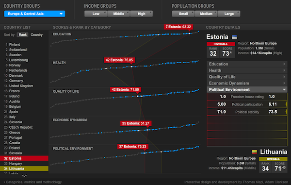
This Newsweek best-country infowidget is plainly cool. Run your mouse down the list of countries, top to bottom, and watch the waves ebb leftwards. Run it along any of the lines and see the spiky flow whip along the others. Pick subsets along the top and see dots light up across the lines. This is data sorcery, turning mute masses of numbers into effortless insight. Insight? Sight, anyway.
As a designer of generalized data-analysis tools, though, I'm almost invariably frustrated by these things. They look like magic, and I have lots of places where I want things to look like magic. But to look like magic, reliably, they actually have to work like machines. I want to be able to pour other data into this structure. I admire the heroism that went into solving this one specific information-display problem, but I don't want every new data-analysis task to always require new heroism. If you have to keep doing it over and over again, it's not heroic any more.
But when I start taking these things apart, so that I can figure out how to put them back together with other data inside, I discover altogether too much convenient "magic" where I need simple reliable gears and levers. Like:
- What happens if the lines in the middle aren't as flat as these, or there are more than five of them, or there are more than 100 data points, or the measurements aren't as correlated?
- In fact, there are more than 100 data points here, or at least there should be. If I were Burkina Faso, dangling at the end of those Education and Quality of Life lines, I'd be pretty angry. There are almost 100 more countries not shown here, all of which are by definition below them in overall score. There's a big difference between 100th out of 100 and 100th out of 200.
- Why can't I do other "regions", and why can't I filter combinations of region/income/population? And why do the filters go region/income/population, but the stats on the right go region/population/income? And what if I had 9 sets of categories instead of 3? And shouldn't there be maps somewhere?
- What if the measurements aren't all numbers (or aren't all single numbers)?
- And as cool as the waves and spikes look, are they actually the most informative information-design choice? They emphasize shapes, but since the five metrics are independent, these shapes are not actually meaningful per se.
- The wide aspect-ratio of the lines makes rank dramatically visible on the horizontal axis, but absolute value hard to visually assess on the vertical axis. The waves reinforce this further, especially if you select two countries to compare them. But isn't absolute value far more significant than rank on all of these measures?
- And what if I need to compare 3 things, instead of just 2? Or 9? Or 15?
- What if I want a different weighting of components in my overall score? What if I want a different weighting of subcomponents in my subscores? What if I want a different number of subscores, or different groupings? What if I want to add or remove measurements? How do I check if a dot is right? How do I examine what it means?
- What about latitude and longitude, or year of independence, or soccer rank, or internet usage, or libraries per capita, or coffee quality?
- Why did they reinvent the scroll bar? Never reinvent the scroll bar.
- Really. Never reinvent the scroll bar.
- If you're going to use color to show low/middle/high and small/medium/large, why bucket them? Why not show a continuum? Why not show sliders for filtering at arbitrary points?
- Not that sliders don't have their own UI issues, as they encourage visual outlier-clipping, which is rarely a statistically straightforward thing to do to data.
- Why does nothing here show any indication of precision or error, and what would happen to the display if it did?
- How would you use this if you were blind? Why doesn't it scale with the browser window?
- And how, even if we could answer all those questions, do you get any other set of data into this? How do you manage the data behind this? Where is "behind this"?
So yes, this is cool. I'm glad it exists. But I can't help feeling like this is not really the way we win the war against ignorance. We can't afford to solve every problem with this much specificity. And even this, I suspect, is a symptom: we get solutions with such specificity because there is such a poverty of solutions with generality. When there's no easy way, all the hard ways start sounding about the same.
And thus my own far less glamorous life with data: lists, tables, numbers, the occasional stripe of color. It won't let you makes waves and spikes out of your data, but then, neither will this. This thing won't let you do anything with your data. Something should.
